Packaging Design - Branding - ReDesign
This project was a full rebrand and packaging redesign for "On The Rocks," a premixed cocktail company. The original branding felt cluttered and in my opinion wasn't taking advantage of the bottle as a design surface. So my goal was to strip it back and build something that feels more high class and aligns more closely with its name. Speaking on the name of the company as the only aspect of he brand we needed to keep I wanted my concept to play on both meanings of "on the rocks" the cocktail term and the literal imagery of a rock or in this case a glacier. My logo is a martini glass with a glacier silhouetted in negative space, which feels simple on the surface but rewards a second look.
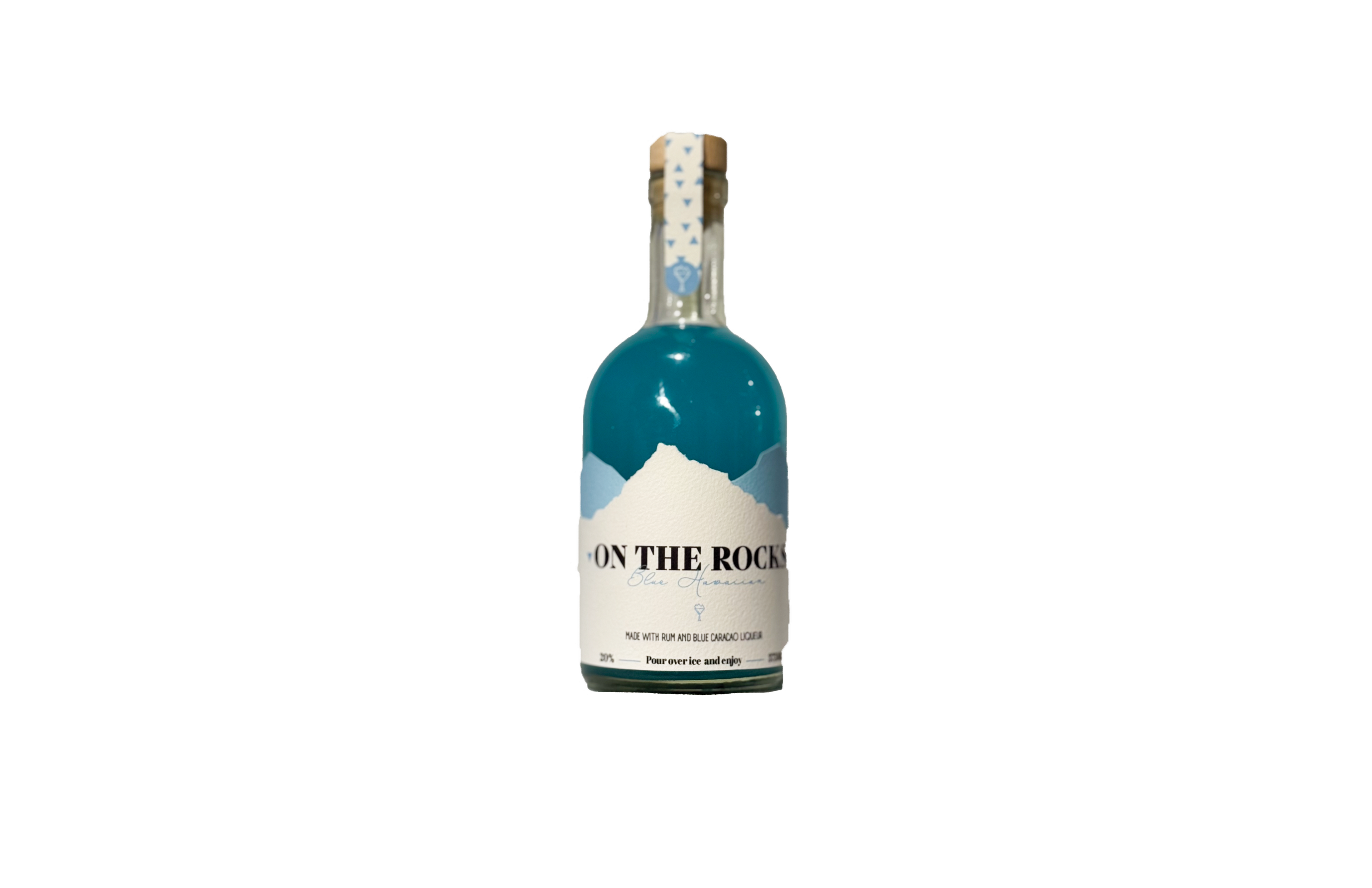
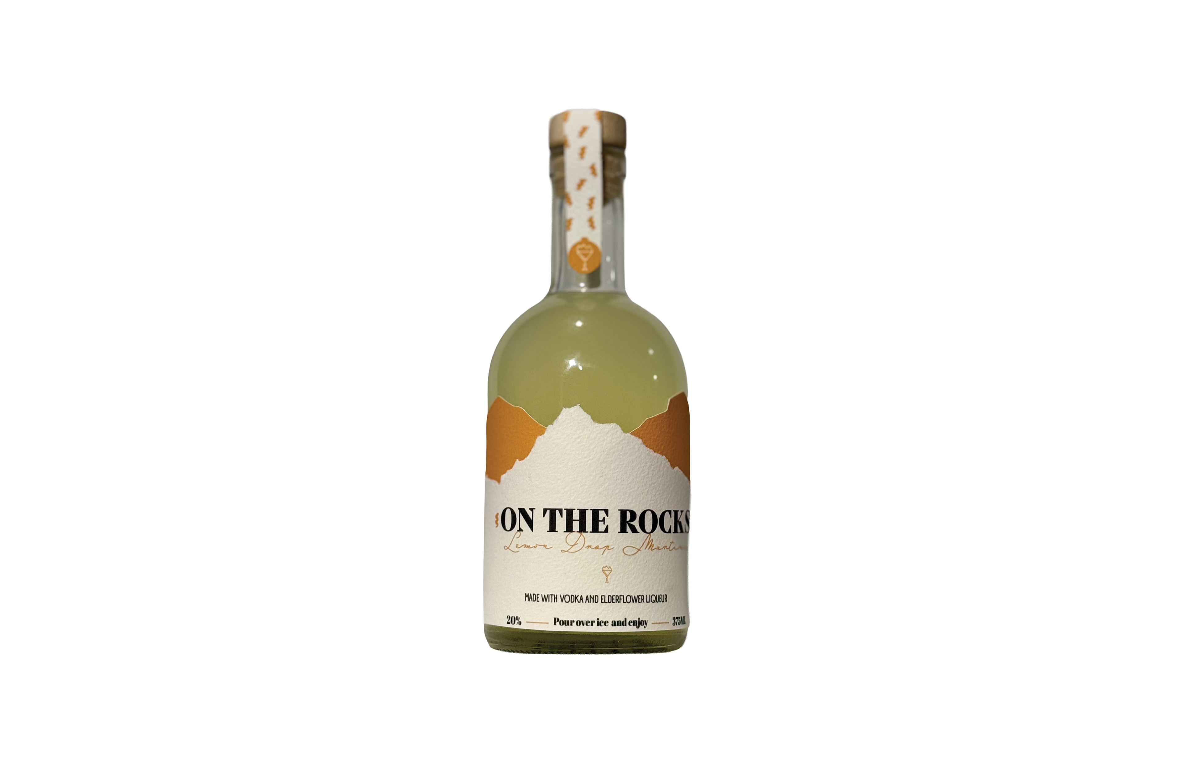
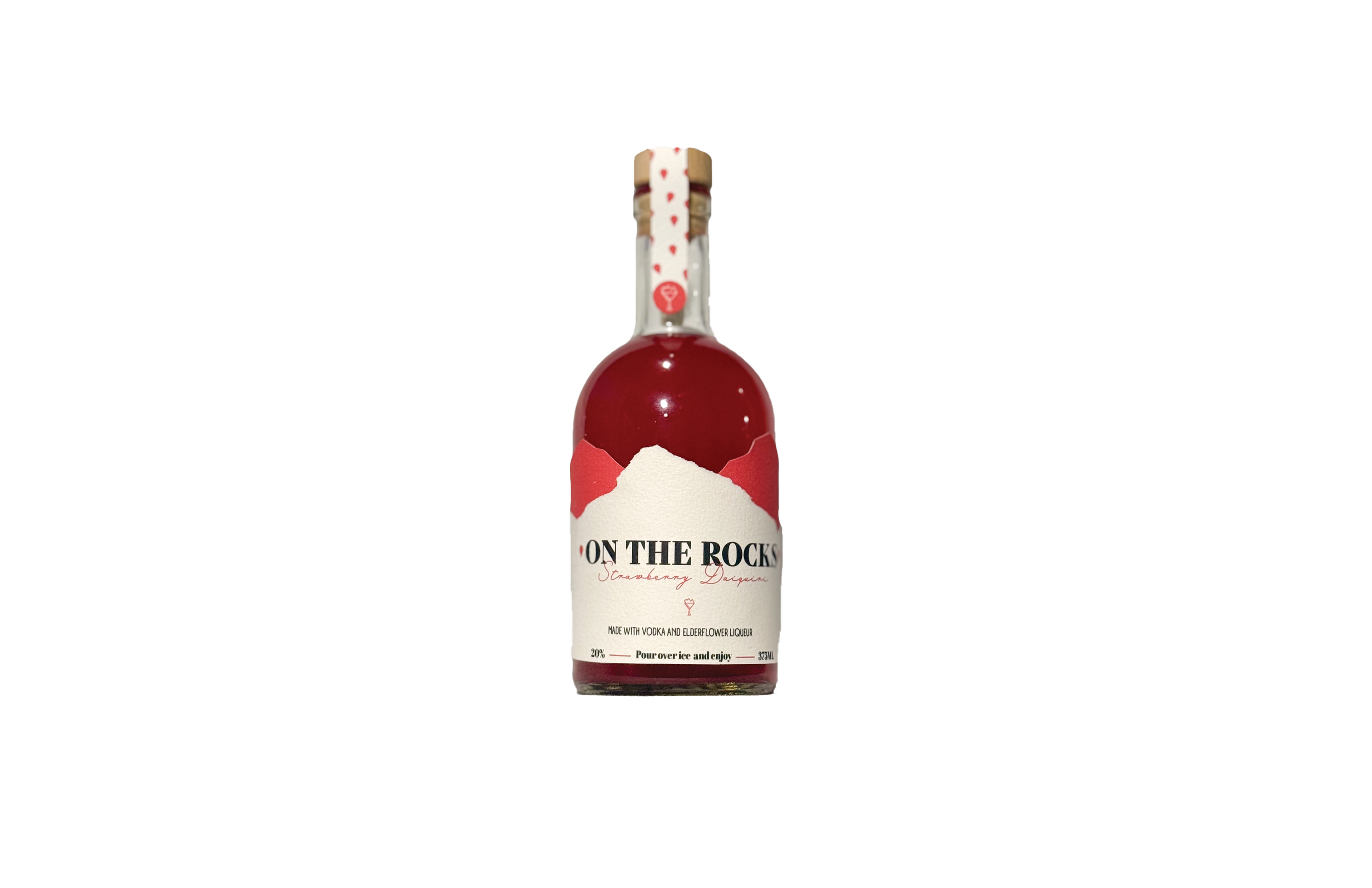
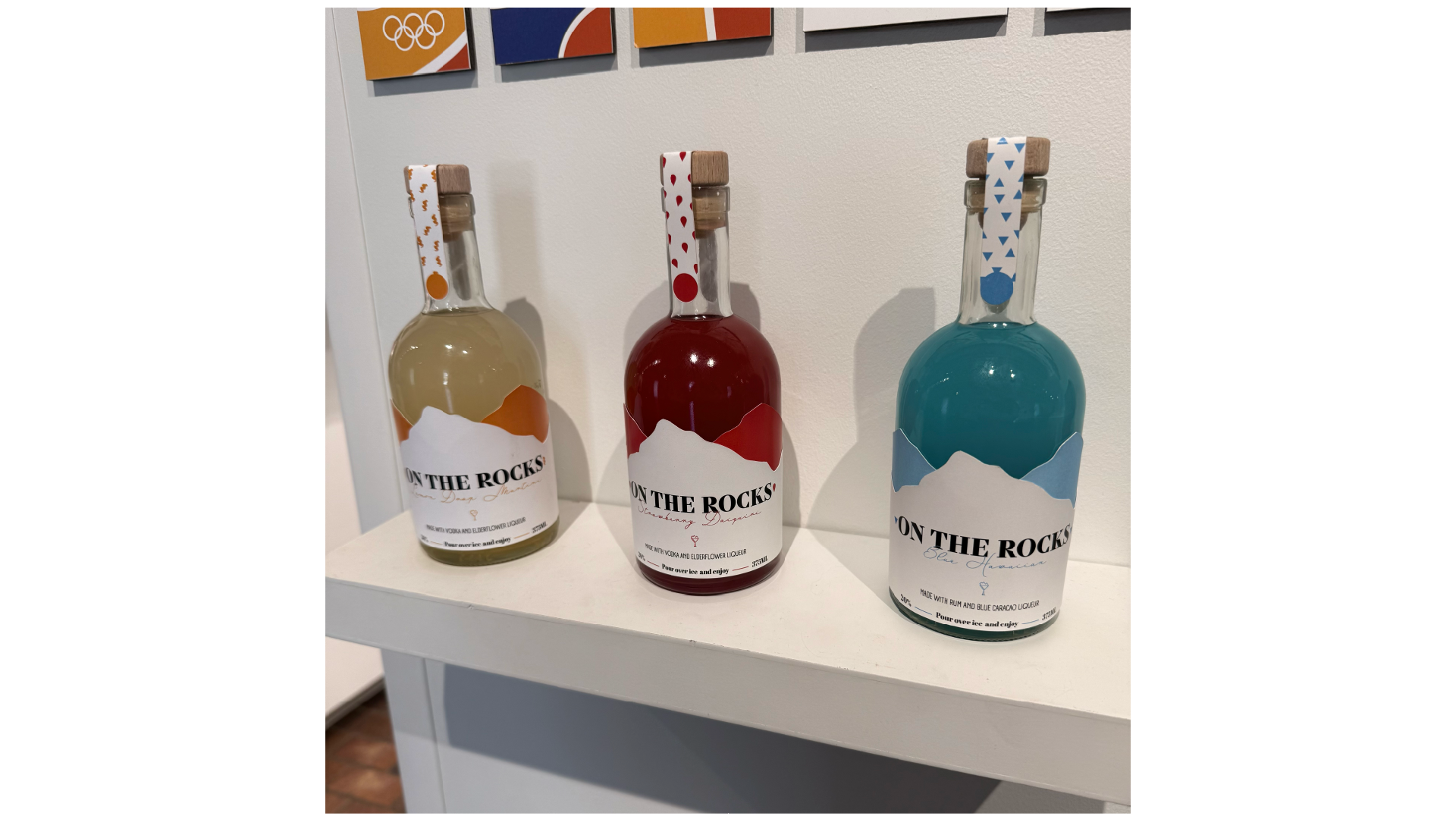
The bottles are where I'm most proud of the execution. Each label has a die-cut top edge shaped like the jagged ridgeline of a glacier, so the liquid color of the drink itself becomes part of the design. The color palette for each bottle pulls directly from the flavor, keeping the series feeling cohesive while still letting each one have its own personality. The whole thing is minimal, a little sophisticated, and something i think you should be proud to put on a bar cart or on the table at a gathering.