Branding - ReBrand - Package Design
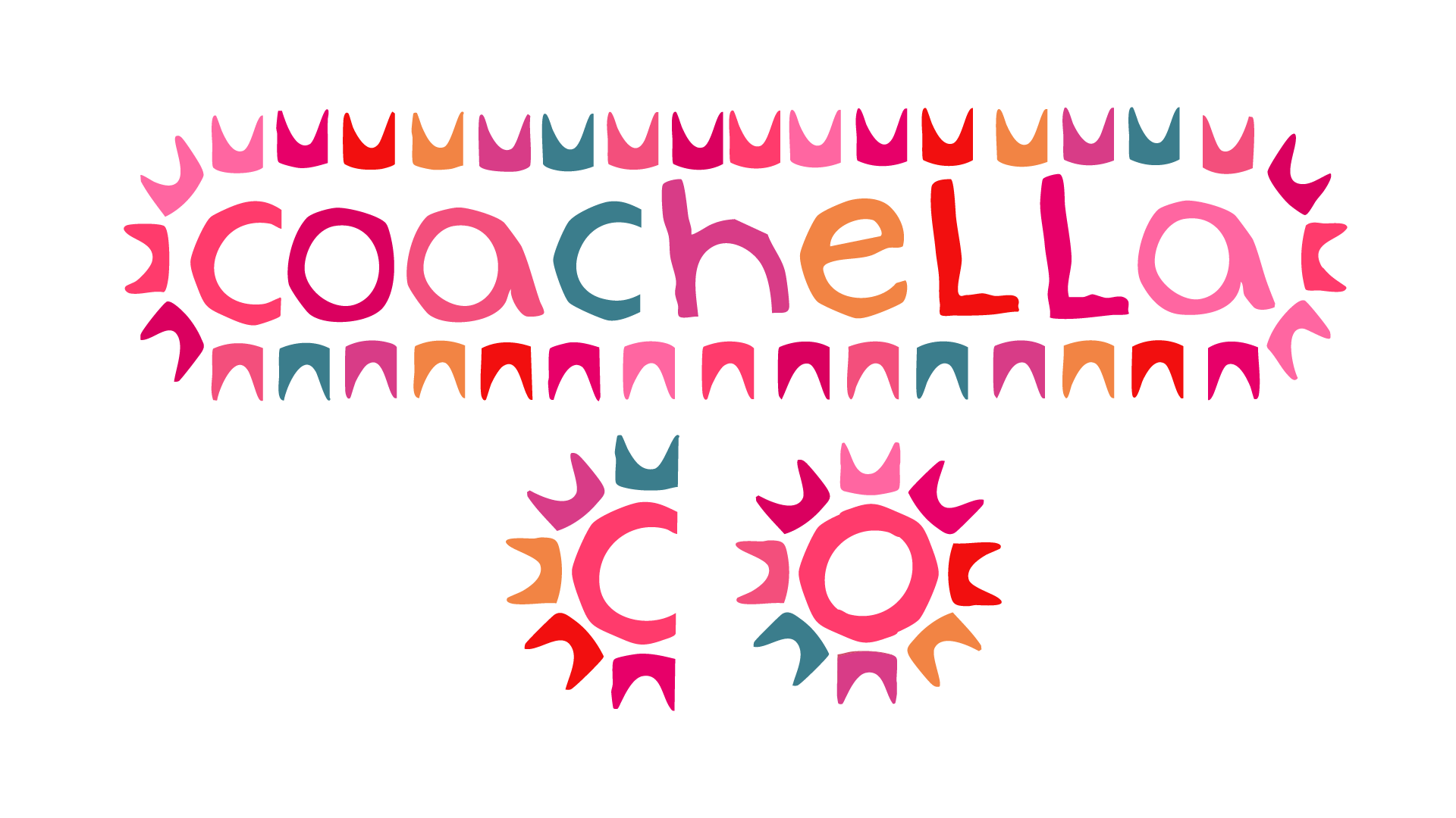
Coachella has always been a festival I have been a little mesmerized by and as i got older every time I looked at the existing branding I stated to feel like it could be so much more. So when weere asked to redesign any company from the ground up i was really excited to pick something that I had already noticed and thought about before. my goal was add a little more fun to the branding; to make it feel like what happens at a festival. The logo system has three variations all anchored in the sun and the desert, because that landscape is as much a part of Coachella as the music itself.
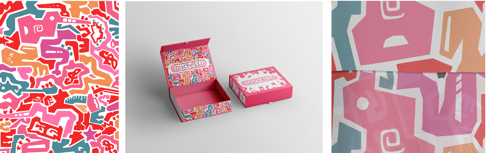
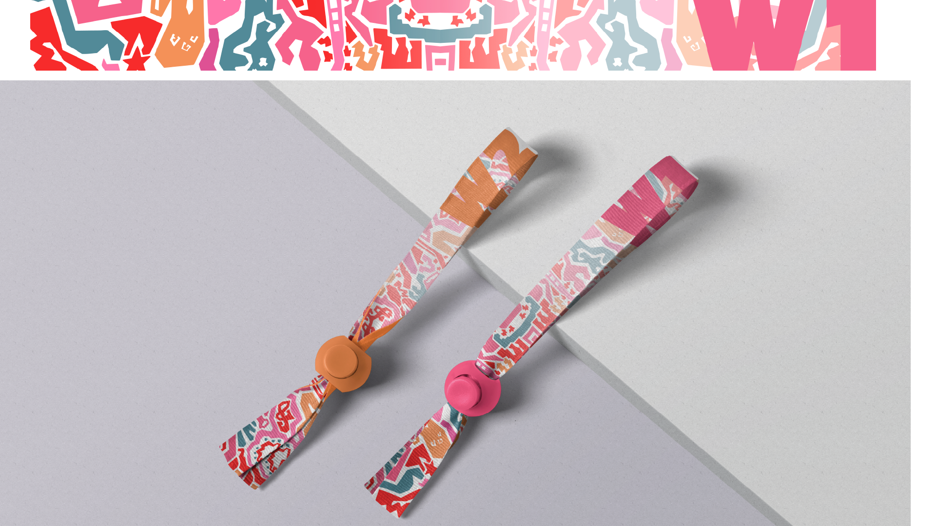
if there is one part of this branding i think sets it apart its the pattern which consist of an illustration of abstract instruments that became the visual thread running through everything else I made. Business cards, envelopes, letterhead, a VIP box with a wristband and custom wrapping paper — all of it tied together by that same chaotic, joyful energy. I wanted someone to open that VIP box and already feel like the festival had started.